Gutenburg is in many ways a step backwards. For example, you now have to use a hack to implement adaptive column layout, as the framework exposes no way to use a @media query or even a custom CSS selector. This hack is also extremely funny and exposes some intriguing design in Gutenburg.
All steps are based on the twentytwentythree theme, WordPress 6.1.
Hack a JSON in a PHP file
Open templates/home.html or templates/index.html. Each by default contains a query loop we are interested in:
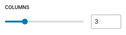
<!-- wp:query {"query":{"perPage":3,"pages":0,"offset":0,"postType":"post","order":"desc","orderBy":"date","author":"","search":"","exclude":[],"sticky":"","inherit":true},"displayLayout":{"type":"flex","columns":3},"align":"wide","layout":{"type":"constrained"}} -->Note that the number of columns, 3, is hardcoded in this theme template file. You can change it, but it just generates future pages with that fixed number, not the responsive columns we wanted. It is also extremely interesting to see such a customization JSON hardcoded in PHP.
So I read the source code of the page generator (snapshot). Below line 65:
$classnames = '';
if ( isset( $block->context['displayLayout'] ) && isset( $block->context['query'] ) ) {
    if ( isset( $block->context['displayLayout']['type'] ) && 'flex' === $block->context['displayLayout']['type'] ) {
        $classnames = "is-flex-container columns-{$block->context['displayLayout']['columns']}";
    }
}
This code appends the value of columns to the string "columns-" to form a CSS class name. The CSS class itself is defined in a non-customizable CSS file in Gutenburg, served to the client directly, in order to manipulate the width of child elements.
It is hilarious to see this code. Type checking is not the major point here, but that it concatenates CSS classes together so the client can render a fixed count of columns. For modern web applications, the server never decides any adaptive layout; that is the task of the browser.
In order to apply our own style, we just need to change the columns value to "n" (a string!), and the resulting CSS class name becomes columns-n. Then we write a custom CSS file to apply desired styles to the target elements.
Custom CSS
You need to add this globally via /wp-admin/customize.php.
This defines specifically the columns-n class.
@media (min-width: 600px) {
    .wp-block-post-template.is-flex-container.columns-n>li {
        width: calc(50% - 0.625em);
    }
}

@media (min-width: 800px) {
    .wp-block-post-template.is-flex-container.columns-n>li {
        width: calc(33.33333% - 0.83333em);
    }
}
No attribution is needed for this short snippet.
Extra
I also implemented a CSS @media query-based dark theme that responds to the system color scheme. Gutenburg cannot do this by itself; there is no way to delegate a color scheme as the dark one. So I wrote my CSS again.
Changes to the Gutenburg theme variable did not apply to the main menu, because the components specify yet another set of colors. It was ultimately overridden.
The code, although trivial:
@media screen and (prefers-color-scheme: dark) {
    body {
        --wp--preset--color--base: #000000;
        --wp--preset--color--contrast: #ffffff;
    }
}

.wp-block-navigation:not(.has-background) .wp-block-navigation__responsive-container.is-menu-open {
    background-color: var(--wp--preset--color--base);
    color: var(--wp--preset--color--contrast);
}
Comments
One response to “Gutenburg Adaptive Column LayoutHow This Site is Stylized”
[…] Gutenburg, which I recently complained about. You can define templates and themes up to a certain […]